
 English
 Svenska
Categories
Creating a mobile-responsive website
Your Website Builder site automatically adapts to look great on any screen size.
On this page
Your Website Builder website is professionally designed to look perfect on any device. You do not need to do any custom design for mobile devices.
All blocks are mobile-optimized and designed to fit the size and format of any device. Your published website automatically resizes (shrinks or enlarges) to look good on all devices, regardless of screen size and orientation.
Mobile-friendly design
You do not need to change your block elements for mobile design when building a site, it is all done automatically. However, your website might look a little different when viewed on a mobile.
Mobile screens are typically smaller and more narrow than desktop screens. This is why all block elements are stacked vertically when the website is viewed on a mobile device. This helps your visitors easily navigate your site on a smaller screen, without needing to scroll horizontally or zoom out to see the whole page.
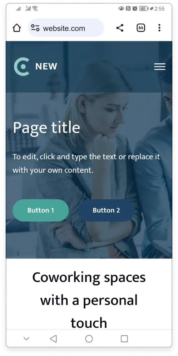
Horizontal elements stack vertically
If your block has several elements aligned horizontally, for example in the Features or Products blocks, these elements are stacked vertically in a single column on mobile.
Device orientation
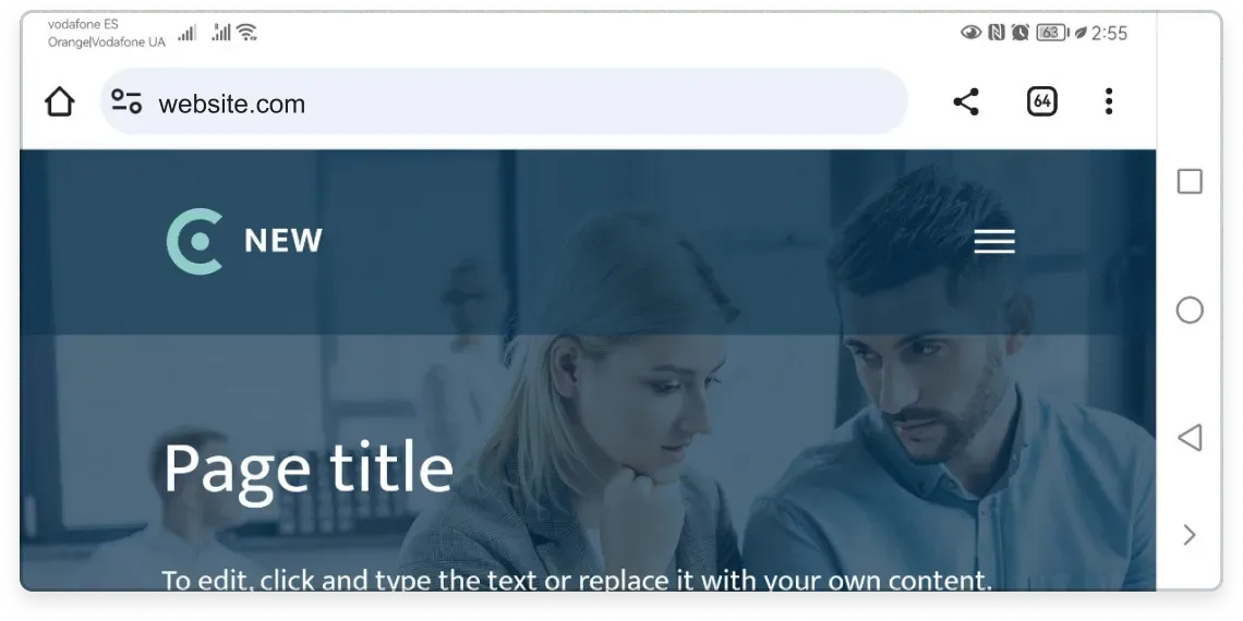
Your website design stays responsive when your users rotate their mobile devices. The block elements remain stacked vertically.
Related articles
- About mobile editingHow the mobile Website Builder lets you create and edit your website from any phone or tablet.
- First steps to building your website on mobileSign up and use the Setup Wizard to pick a template and set up your site from your phone.
- Adding website content on mobileAdd and edit blocks, images, text, and downloadable files from your mobile device.
Can’t find what you need?
Contact our team. We’re here 24/7 by email and ticket.