
 English
 Svenska
Categories
Custom block
Build a block from scratch by arranging widgets like text, images, buttons, and forms exactly how you want.
On this page
If you cannot find a suitable block in the Blocks library, or you are just feeling creative, choose a Custom block and fill it in with your own content.
You can use the Custom block to create a unique block layout by arranging the block elements (widgets) in your own way. By using the right widgets, you can place a picture next to a form, a video next to a button, and so on.
Adding a custom block
The Custom block is located at the top of the Blocks library.
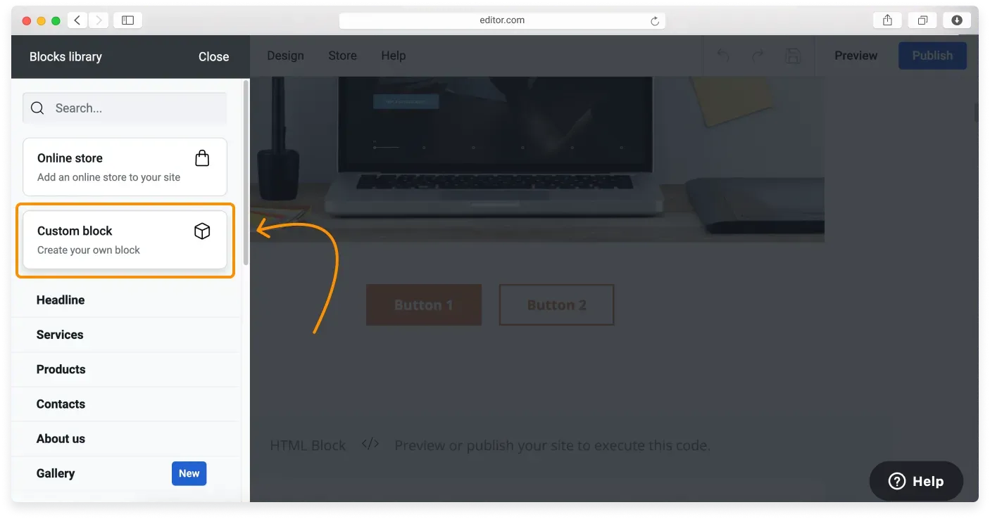
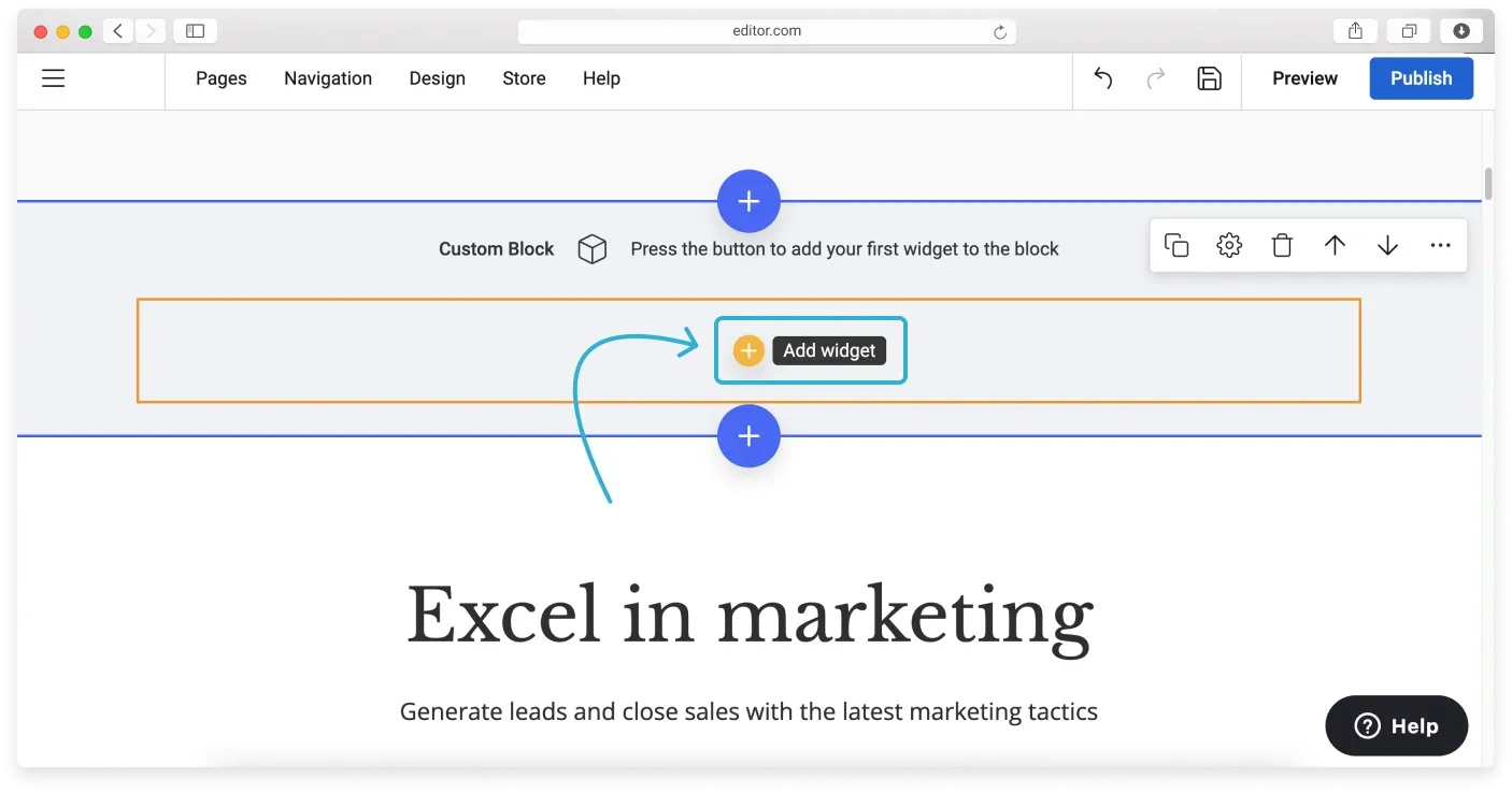
After adding the block to the canvas, you need to add the widgets you need. Click the yellow Add widget button to do this.
What widgets are available?
The widgets are divided into sections so it is easy to navigate through them. You can also look up a widget by entering your query into the search bar at the top of the Widget library.
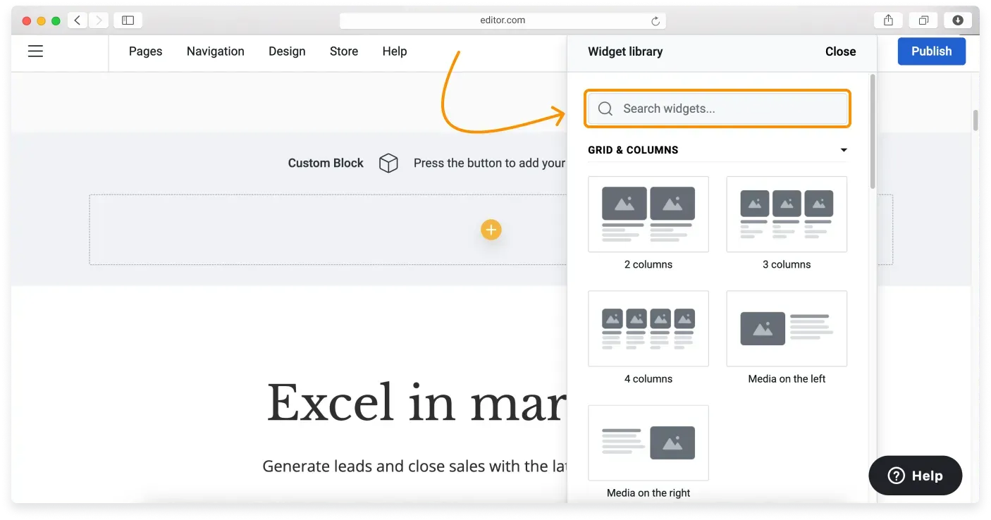
Below is the list of sections with their widgets.
Grid and Columns
Grid and Columns widgets help you shape the layout of your Custom block. They act as dividers with containers, and you then add other widgets to them.
Use one of the Grid and Columns widgets to divide your block into vertical sections. If you want to add widgets one on top of another (not side by side), you can skip this section.
If you want to arrange your widgets side by side, choose one of the widgets below:
- 2 columns widget: divides your Custom block vertically into two columns. You can add separate widgets to both columns.
- 3 columns widget: divides your Custom block vertically into three columns. You can add separate widgets to all three columns.
- 4 columns widget: divides your Custom block vertically into four columns. You can add separate widgets to all four columns.
- Media on the right/left widget: replicates the layout of the About us block. The gap between columns is bigger than in the 2 columns widget, which improves readability when a large media element sits next to text.
You can change the number of columns in one row, or switch the element layout, in the block settings.
One grid per block
You can only add one of the Grid and Columns widgets to a single Custom block. For example, you cannot put a 2 column widget on top of a 3 column widget, or inside it. However, you can add two custom blocks and use a 2 column widget in one and a 3 column widget in the other.
Column settings
After adding a new column, you can add widgets to it. When you select a column and open its settings, you can change the appearance of the column you are working with, such as:
- color scheme
- alignment
- border
- shadow
- corners
- spacing
You can also change settings for all columns in the block:
- layout
- alignment
- columns per row
- column width
- column height
- borders
- shadows
- corners
- spacing
Tooltips for guidance
When you hover over a setting name, a tooltip appears with extra guidance.
Widget settings can vary depending on the selected alignment. For example, if a tile contains images and is left aligned, resizing keeps the image positioned to the left. If the image is centered, resizing centers the content, including text elements.
Stretch columns feature. This option stretches all available columns to match the full width and height of the tallest column in each row. If a layout includes two rows of tiles with different numbers and sizes of tiles, this feature keeps everything evenly aligned across both dimensions for a more consistent design.
If you have set the Column width to “Fixed” or the Column height to “Hug”, you can manually adjust the alignment settings to center the columns as needed.
Basic
These widgets are the basic elements of any site: buttons, text containers, icons, images, and more.
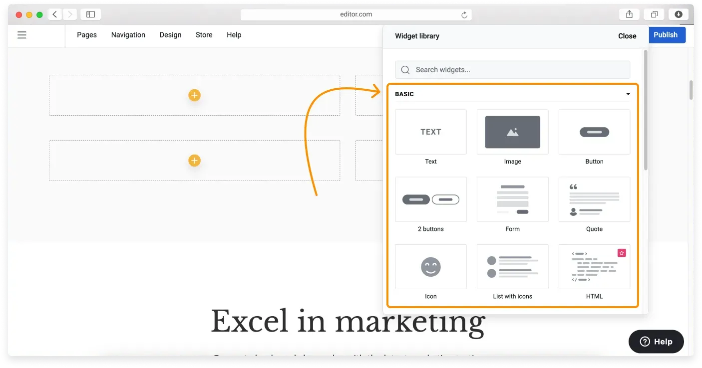
Here is the full list of Basic widgets:
- Text: add any text to your block, including links.
- Image: add an image to your block.
- Button: add a button to your block, which you can then link.
- 2 Buttons: add two buttons at once. You can edit them separately.
- Spacer: add extra space between two other widgets, such as an image and text, and adjust its height.
- Form: add a contact form to your Custom block.
- Quote: consists of a text element, a small image element (if you want to add a photo), and another text element where you can add a name.
- Icon: add a social media icon or any other icon from the collection. A nice little media element to make your website look more professional.
- List with icons: combines icon elements with text elements. Perfect for listing the services you offer. The items in this widget can be duplicated.
- HTML: add custom code to your block.
Media
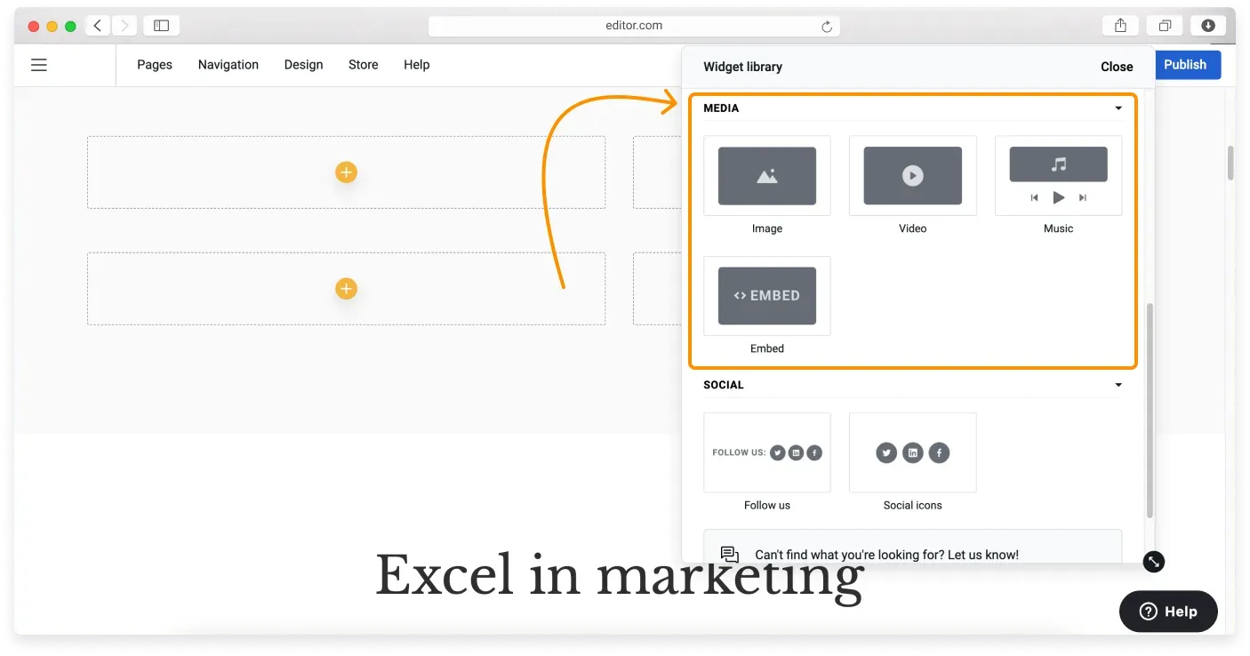
If you want to add a photo to your site or embed an audio track, choose one of the Media widgets:
- Image: add an image to your block.
- Video: place a playable video inside your Custom block.
- Music: embed an audio track, such as a piece hosted on SoundCloud or another audio platform. This works like the video media, through a link or an embed code, depending on what the platform provides.
- Embed: besides video and audio, you can embed any other third-party solution that works through an iframe code, such as a Google document, a Google calendar, or an Elfsight widget. If a code you want to embed is not an iframe, add it through the HTML widget.
Social
Social widgets let you add social media icons and link them to your social media accounts.
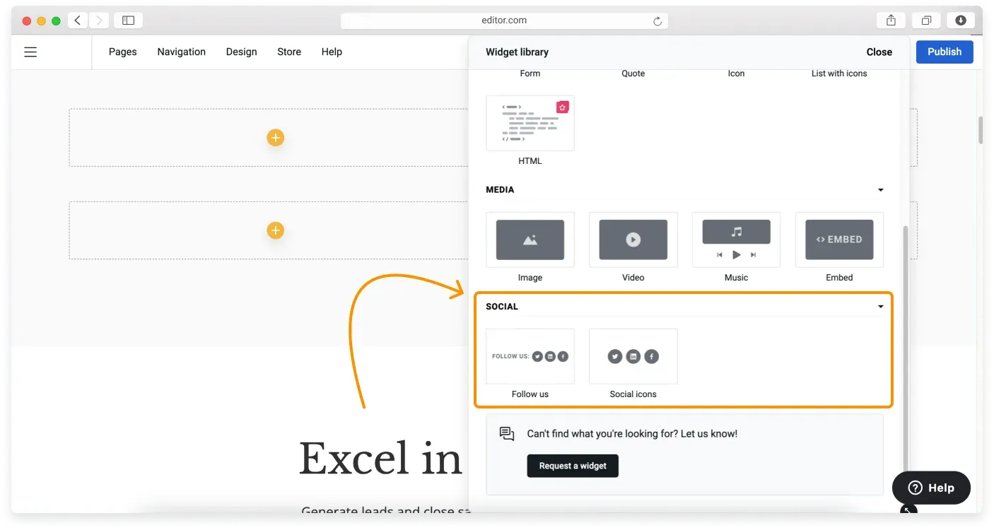
- Social icons: four of the most popular social media icons in one place. You can change them to your taste or delete any you do not need.
- Follow us: the same as the Social icons widget, but it also includes a “Follow us” text element. You can change this wording too.
Customizing block settings
As with any other block, you can customize the Custom block using its control pane. To open it, click the block and then click the Block settings icon.
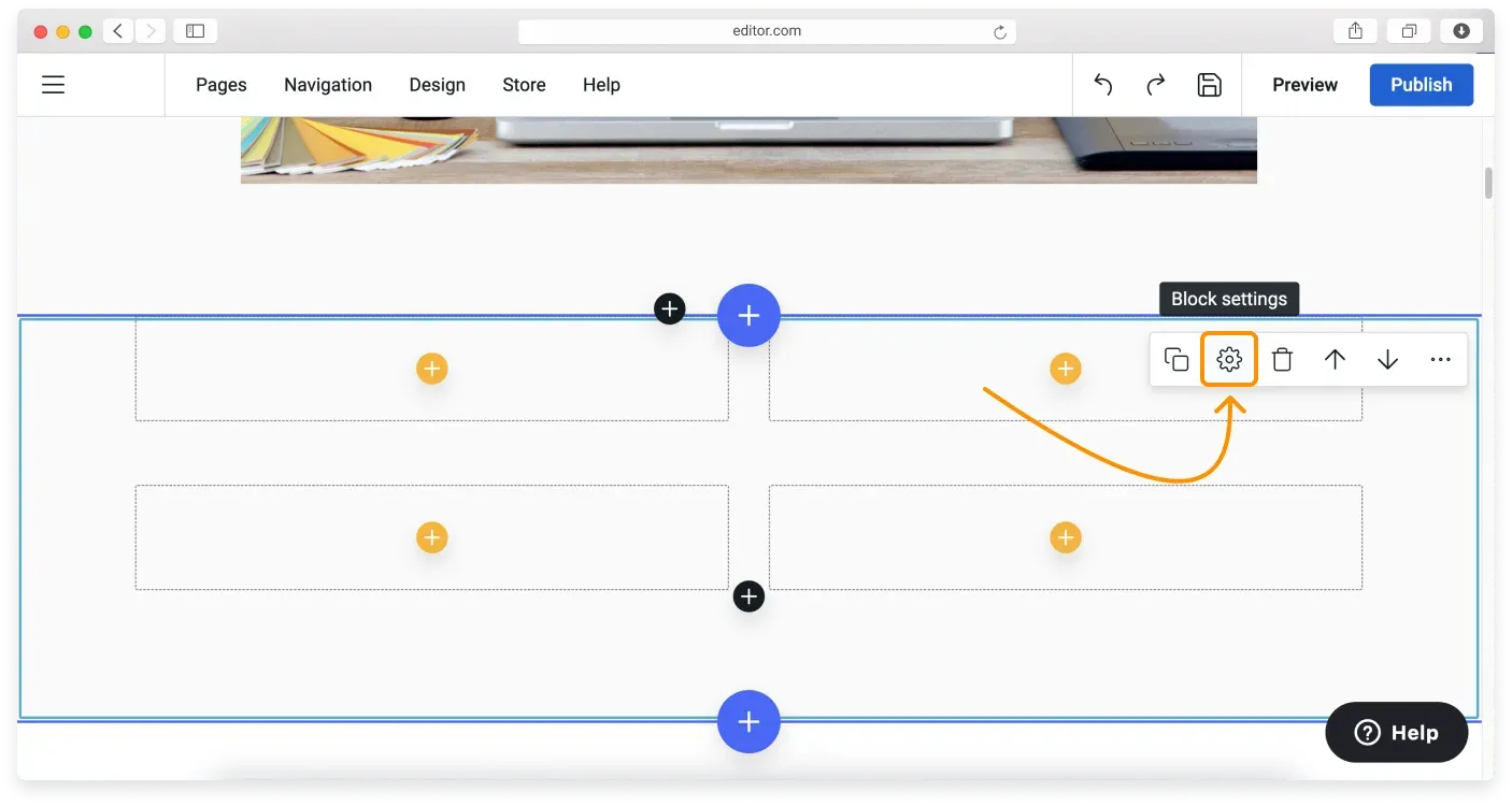
The Layout tab is not active for the Custom block, because you set your layout using Grid and Columns in the Widget library.
In the Appearance tab, you can make the following changes:
- Block style: change the color scheme of the block.
- Block spacing: change the whitespace at the top and bottom of the block.
- Vertical alignment: align your content to the top, center, or bottom of the block.
- Columns layout: choose the number of items in a row.
- Background settings: add a background image to this block.
Once you are done, click Save to confirm the changes. Read about block customization options in detail in our Block settings article.
Duplicating widgets
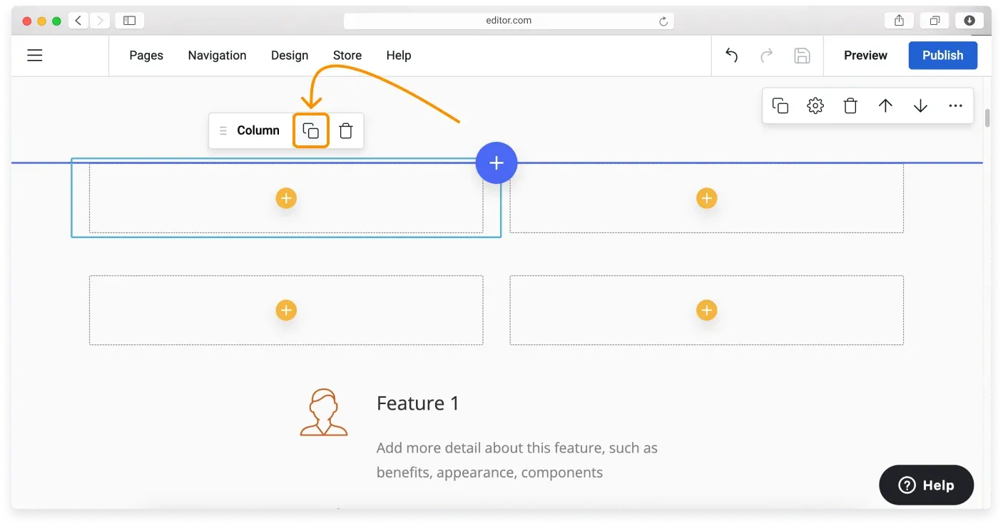
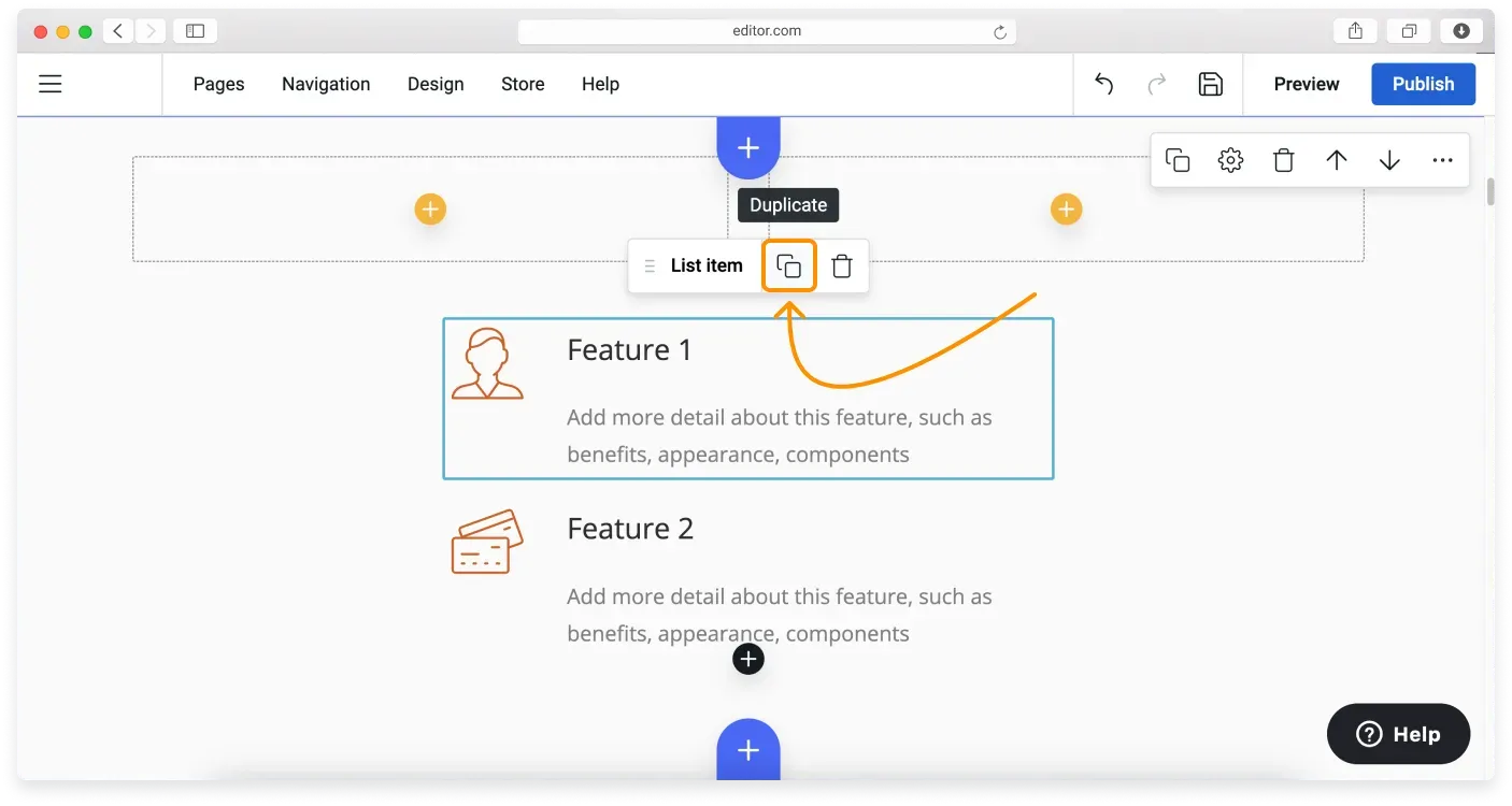
Any widget within the Custom block can be duplicated. To duplicate a widget, hover over it to activate its control pane and then click the Duplicate button.
The items in the List with icons widget can also be duplicated within the widget itself. Hover over a list item and click Duplicate.
Duplicating a column
When you duplicate a column, all the widgets in it are duplicated too.
Resizing widgets
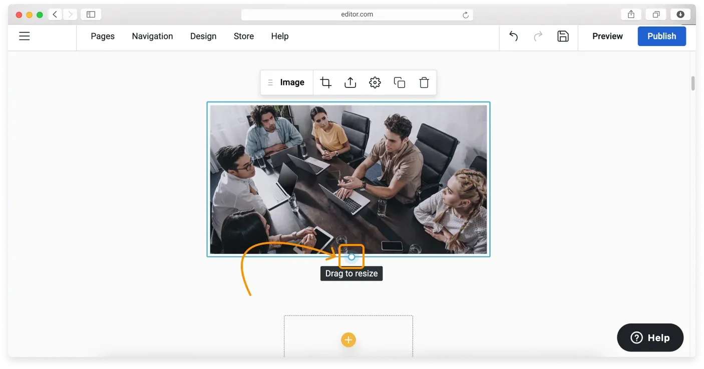
You can resize the widgets that contain media: Image, Video, and Music. To resize any of them, click the widget and drag the Resize control at the bottom of the media.
The Text widget can be resized by dragging the controls on its sides.
Moving a widget
All widgets can be moved within a Custom block. To move a widget, hover over it, click the Move button, and drag it to the new location.
Moving a column
When you move a column, all the widgets it contains are moved too.
Deleting a widget
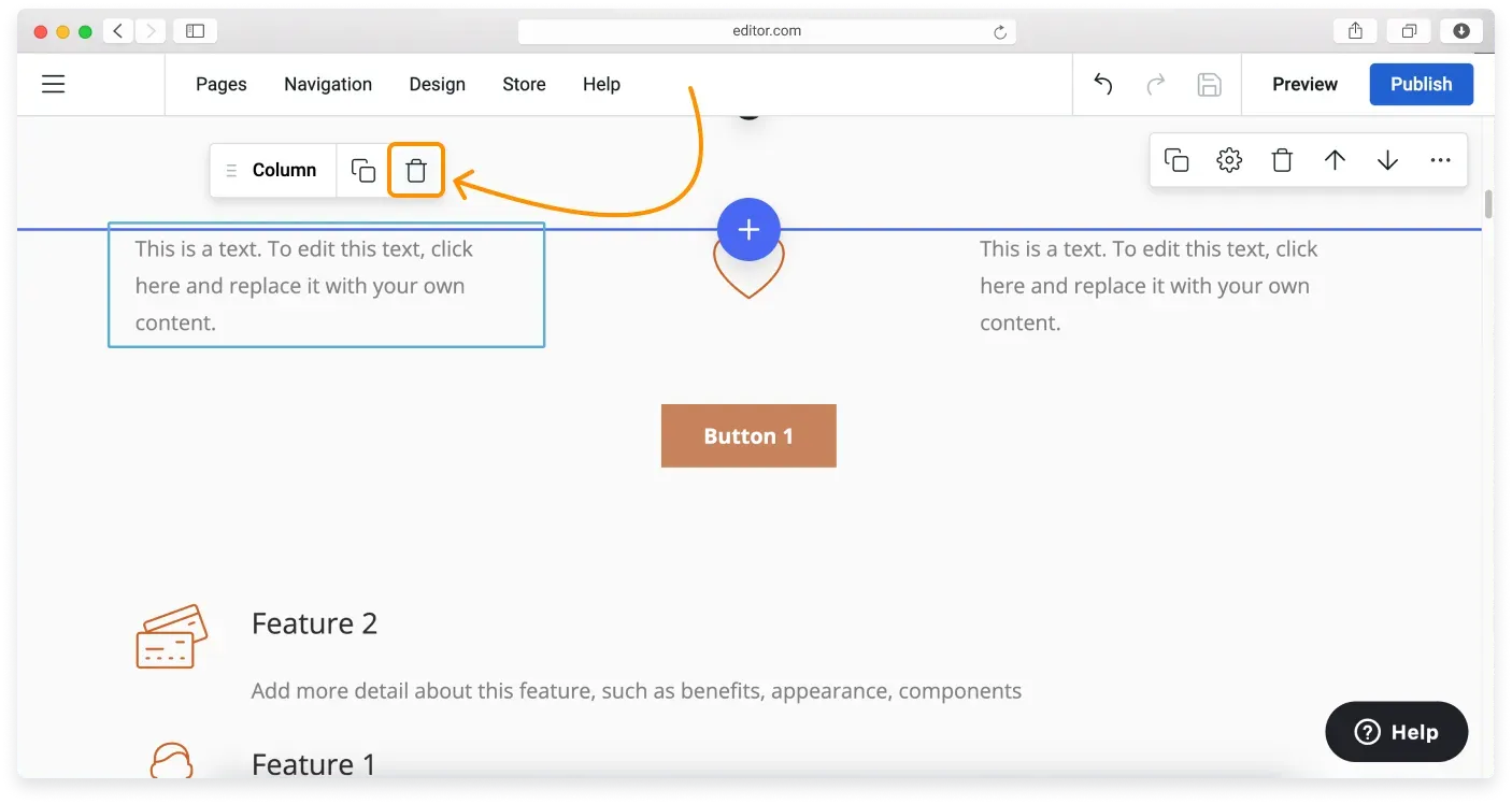
To delete a widget, hover over it and then click the Delete button.
Deleting a column
When you delete a column, all the widgets it contains are deleted too.
Editing text in the widgets
To edit the demo content, click the text and start typing your new text. You can also copy and paste your existing content from the text editor you are using. For more, see our Text editing and formatting tutorial.
Editing images
You can replace the demo images in the Custom block with your own photos. See our Customizing your images tutorial for detailed instructions, and check the recommended image sizes.
Editing buttons
You can edit buttons in your Custom block to lead to a different page on your website or to an external URL. To edit links in buttons, see our Editing buttons and Deleting buttons tutorials.
Related articles
- Block settingsAdjust a block's layout and appearance, from background and spacing to alignment, borders, and overlays.
- Premium blocksAccess advanced, trend-focused block layouts available on paid Website Builder plans.
- Managing the navigation menuAdd, rename, reorder, and set click actions for the items in your site's navigation menu.
Can’t find what you need?
Contact our team. We’re here 24/7 by email and ticket.